

A poster generally needs to be seen from a further distance. Read this guide on how to choose the perfect poster fonts that stand out!
When designing a poster, your primary focus will be on the art. You want to make sure you combine compelling images and messages to connect powerfully with your viewers.
Your decision on poster fonts serves another equally critical function. Fonts guide readers through your poster, especially when you have a lot of information to share.
Bad fonts lead readers astray. The right fonts will help them absorb information more effectively.
So what are the best poster fonts to use? Follow our advice below to find great fonts to use in your poster. Keep reading to learn more!
Things to Keep in Mind While Choosing The Perfect Poster Fonts
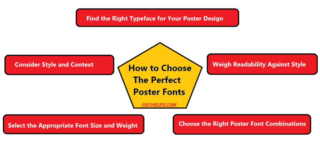
Consider Style and Context When Choosing Poster Fonts
Fonts can help or hurt the design. A bold font would work best for an advertisement with a serious tone. Playful fonts would be more suited to a design that seeks to put a smile on viewers’ faces.
Serif fonts, such as Times New Roman, are often more proper for longer texts and traditional designs. Sans serif fonts, such as Arial, look better for shorter texts and modern designs.
The font you choose for the text on the poster will play a significant role in effectively conveying the desired message. There are a variety of free poster templates for events that come with various predetermined fonts. You can also take a creative approach and try out different fonts.

Select the Appropriate Font Size and Weight
If the purpose is to draw attention to a larger space, then a larger font size would be more proper. For smaller spaces or subtle promotions, a smaller size may be more proper.
Consider the font weight. A bold font can be used for titles or headlines to draw extra attention. A lighter weight is often used for the main body of text to keep the design in balance.
Choose the Right Poster Font Combinations
When it comes to poster font combinations, contrast is key. Take the time to consider what style of fonts to use and how the fonts complement each other. Generally, sans serif fonts like Helvetica, Arial, or Verdana are best combined with serif fonts like Garamond, Times New Roman, or Georgia.
Combining two sans serif fonts or two serif fonts will create a more symmetrical look. Combining a sans serif with a serif can add a complementary style. Additionally, avoiding more than two different font types on a poster is a must to avoid becoming overcrowded.
Weigh Readability Against Style
It is crucial to select one that is both easy to read and visually appealing. The size and spacing of the font influence its readability. Some fonts have very thick lines that can be difficult to read if they are not spaced appropriately.
Choose fonts that are legible and easy to read from far away. It is important to trial and error different options to find the perfect combination of readability and style in a font for a poster.
Find the Right Typeface for Your Poster Design
Finding the right typeface for your poster design plays a big part in creating a lasting impression. Size, style, and combination can be used to create a harmonious poster. Take the time to evaluate the design goals and select fonts that will work together to create a great-looking end result.
Get inspired by the experts and start exploring different poster fonts today!
Did this article help you? If so, take a look at some of our other blog posts for more informative reads.
ALSO READ:
Best Free SEO Tools For Savvy Marketers
SEO Marketing – Importance of SEO In Contemporary Competitive Era
How Ophthalmologists Can Improve Their Google Rankings To reach More Customers


